Tuesday, April 29, 2008

Sobering Indeed.

It's good to finally see some 'sobering thought' put into delicately choosing a font for your new book cover.


"Sobering Thoughts is a collection of lyrical concepts and compositions written by Greg Davies between 1991 and 2007. It is a collection of experiences, journeys, emotions, love, hate, darkness, and isolation that has spanned 16 years, 2 countries, and a million memories..."

Yeah that sounds about right.

Monday, April 21, 2008

Immerse yourself....in Papyrus


I'm really hoping this logo is a sweet little teaser to an awesome full blown wall-to-wall Casa de Papyrus. I'm picturing room numbers, mail slots, parking designations, elevator signage, the works. Maybe the swans will be branded like cattle with Papyrus (it actually might look alright when emblazoned via a hot steel rod). And that girl, will she be swimming out front in Lake Papyrus? She's definitely immersed alright...up to her knees in Papyrus.

Wednesday, April 16, 2008

It's Making Me Hungry


The more I look at the word 'Edible', the more it looks like it's been nibbled on by some forest creature. Itty bitty bite marks around the entire perimeter. Don't know what's happening with the other half of the store name? Why is it in caps and floating really high at a quarter of the size? I guess if they didn't do that it would look like they were screaming, "Edible ARRANGEMENTS!!"  

And thank you Brush Script for coming through with the tag line. I thought we all agreed that Brush Script is the signature font and nothing else. What's it doing on a sign?

Saturday, April 12, 2008

wtf Office Store? You promised us Papyrus...


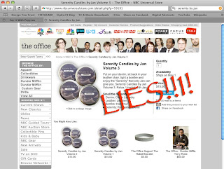
We here at SayItWithPapyrus are huge fans of the Office. And yes, Thursday night we were treated to a spectacular display of modern pop-pyrus implementation. Knowing that this awesome show has in the past kept a very up to date, and hilarious selection of items in their online store, one would need to look no further than here to find some sweet Serenity by Jan scented candles. 

Then, a travesty occurred:

Some douchebag in charge of getting these little ditties made up for the store, completely fucked up his job beyond repair. What the hell kind of font is that on the label? Does that say "Serenity" to you? Well maybe, but you know what certainly says serenity more?? Damn right P to A to P-Y-R-U-S.

Someone needs to have a serious sit-down with this intern and teach him the ropes. Perhaps he was an aspiring graphic designer, who saw the clearly overused Papyrus which was used on the on-set products and banners and figured it was his moment in the limelight to right this wrong. To really show his shining potential to his bosses. 

But you know who's wrong? This kid. 

The office is a brilliant show, no doubt there. They nailed the "Serenity by Jan" product line, kudos to the set-dressers and designers, or whoever else made that call (no-brainer).

And I know what your thinking to yourself. "What if the printer didn't have Papyrus on his computer?" Seriously?? I have a fucking alarm with comic sans labels on it (seriously, no joking). So don't try and give me any of that BS, printers have these fonts. ESPECIALLY printers of cheap novelty goods. It's a staple of their presence in the world. Everyone knows papyrus comes pre-installed on every computer ever made in the last 15 years (citation needed).

So whoever was responsible for this travesty, please right your wrong. There really is no excuse here. I mean you nailed an exact copy of the Schrute Farm Beets T-shrt... which means you have direct access to the production team and their artwork. No excuses. 

Friday, April 11, 2008

Papyrus' Mainstream Television Debut


9th episode of The Office aired last night after a hefty (insert # of weeks) hiatus due to the writers strike. The show returns with a bang, awkwardness so thick it could be cut with a knife. A few minutes after learning Jan has an office and a separate "workspace", Jan's scented candle business is introduced. And what better font to define scented candles then Papyrus. This is probably the first instance of intentionally choosing Papyrus because of it's token cheesy facade, but still priceless nonetheless. 

Rearing it's ugly head again, you'll see a full fledged Papyrus banner in the background behind Michael and Jan:


Cutting Edge Trends


Oh yes, Papyrus has struck again. This time it's finagled it's way into the fabric industry. Under the questionable guise of "Trendy" Papyrus is looking you in the face and saying "What? The people at Trendy Fabrics wanted a trendy font and that's EXACTLY what they got."

Also, loving the perpendicular sign protruding from the building. Ain't no way you're gonna miss the Papyrus - it's staring you in the face from every conceivable angle.

Thursday, April 10, 2008

WANTED : a font that can be "Mr. Right" for anyone

Love the concept behind this little gem of a poster: can we make our dating service poster look like a wild west WANTED poster? Cause I've got this font on my computer here that looks plenty beat-up and old.... think it will work? Do you think people will get the joke, even if we don't even bother finishing off the joke with any of the following necessary ingredients? :
1) a "reward" dollar amount
2) a picture of any kind
3) or a default, shitty microsoft word border

Lucky for them, this poster has been ravaged by the elements in Toronto for long enough that it DOES actually look like it's been taped to that lampost since Billy the Kid was a "single professional looking for a great time."